In this little blog series about tech debt I started with an explanation for non-tech stakeholders, then this article shared a few ideas on how to measure tech debt and finally the one from last week talked about how to charge back tech debt to the business unit in charge of it.
To be clear: Charging back the cost of tech debt is clearly the superior measure in most situations to ensure that it gets reduced. After all money is the ultimate incentive for most people to start an action. However this might not always be possible or feasible. This is where visualization comes into play. When a monetary incentive is not feasible “public shaming” quite often is the next best option to nudge stakeholders to take an action.
Visualization of tech debt requires a few steps:
- We have to decide for an appropriate measure on how to measure tech debt and build a tech debt index.
- The index has to be applied to a structure that is easy to understand for the business stakeholders
- A good analogy or story should explain why having a high tech debt index is bad
- The discussion has to be embedded into a governance framework that ensures a regular follow up
Let’s go through these steps one by one based on an illustrative example.
1. Measure
Let’s assume our hypothetical case example is a bank and that technical debt in the case is mainly driven by outdated platforms. We could measure tech debt in a variety of ways but go for a set of two simple measures that are good indicators of the underlying root cause:
Monthly payment to vendors of outdated vs. target platforms: The first measure is really simple – from the finance department we get the payments to those vendors on the blacklist and those on the whitelist and create a ratio.
Lines of code on outdated vs. target tech stack is the second measure that we use to measure the amount of code sitting in the target vs. the legacy environment. Lines of code is clearly not the ideal measure but as a proxy it should work good enough.
Our tech debt index is then a 50:50 weighted average of these two measures.
2. Visualizing structure
For visualizing tech debt we use a business capability map. This will also require us to map the two tech debt measures we just defined on the business capability domains. In some cases that is quite easy as the current account application only supports the current account domain. For other applications (in particular the outdated mainframe monoliths) it is a bit more difficult to split these across different domains.
Here are a few ways you can split them:
- Expert guess: Just asking a senior developer to guess the split is usually a good way – however as these numbers might be used in a heated discussion we should not put that burden on someone in the organization.
- Money spend or Existing distribution key: If there is already a distribution key, e.g. for charge back in place that is often the easiest one to use for splitting the index across domains.
- (Developer) Team size: Distributing the index numbers according to the size of the teams working on the different topics can be a good proxy as well.
- Equal distribution: If there is no better way of assigning numbers just distribute them equally among the capability domains affected by the application.
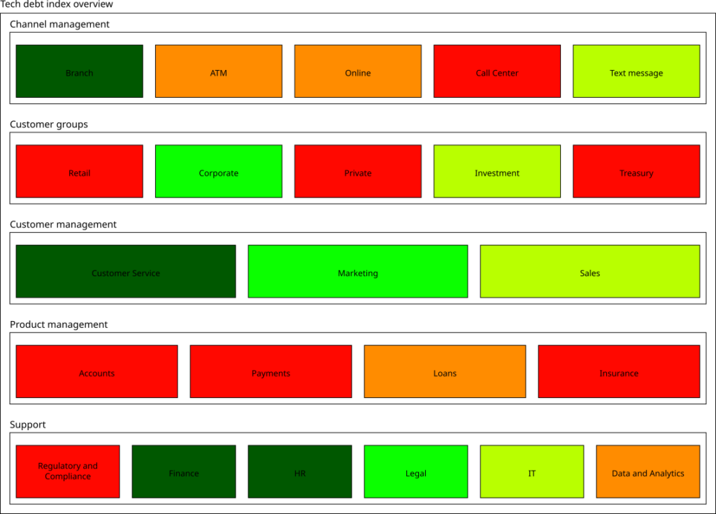
With some help of this little script we can now plot an overview of the tech debt index that looks a bit like the following:

3. Storytelling
Now we have a nice picture – how do we “sell” this to the stakeholders?
Using some kind of framing that relates to the experience of the stakeholders can be very helpful in the communication. In a banking environment this could be for example:
- 🟥 Sell – Technology we should get rid off
- 🟧 Hold – Technology we can still hold but should remove in the mid-term
- 🟩 Buy – Technology we should invest into and expand
(Investment) bankers will instantly understand the meaning of these categories and – maybe even more importantly – understand that you do not want to own a box that is labelled as “Sell”.
4. Governance
Presenting this chart once in the right forum (usually senior management, board meeting or similar) is a starting point. Even more importantly discussing this chart has to become a reoccurring exercise. Ideally this should be a quarterly discussion that could for example be aligned with the quarterly planning.
If the CFO is for example convinced that reducing tech debt and thereby the cost base is a good thing one might be able to convince him to team up and include it in the financial planning and review cycle. Strategy reviews or regular IT updates might be another good place for a regular discussion.
As a last resort you can also just send the analysis and the measures taken to the relevant stakeholders as a report.
No matter what you do – it should get presented often enough so that people in charge start to feel bad if their color has not changed since the last touch point.
