Good decisions on the IT project portfolio are essential for driving business strategy. A good decision requires a solid process and a good visualization for the decision makers. We will talk about the process in another post and focus today on the visualization part.
A standard way to visualize the project portfolio would be to plot the cost against the benefits:
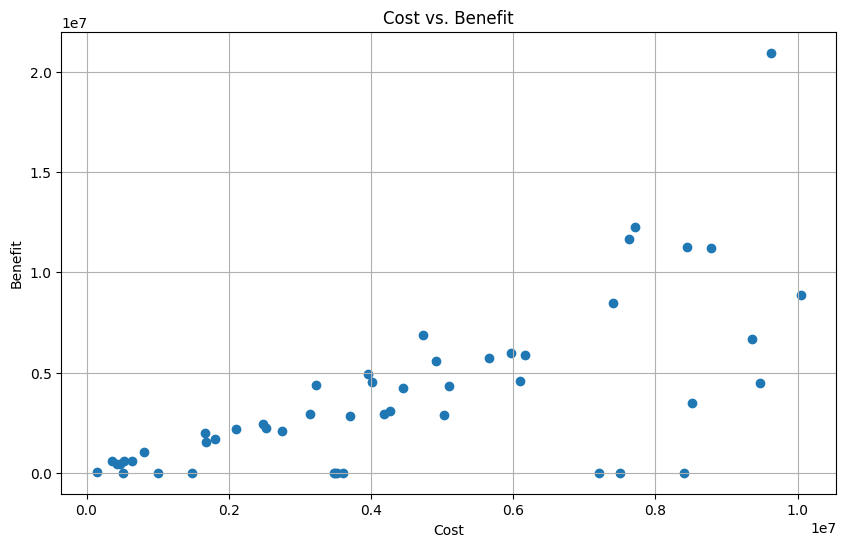
This is a good starting point as the it means that there is some kind of definition of benefits and cost. Before we start to improve the visualization of this fairly cluttered chart let’s emphasize that this should be a Total cost of Ownership (TCO) view of the project and not an annual slice. This means in particular:
- It includes all the project cost from initial idea to go live
- It includes all the run and operating cost of the delivery over it’s life cycle
- The same applies for the benefits.
Most companies only plot the project costs of the initial year. Then there is a decision about the 1 million in year one but it is not transparent to the decision makers that starting the project also includes a commitment to an additional 5 million in project and 4 million in run costs might be less transparent.
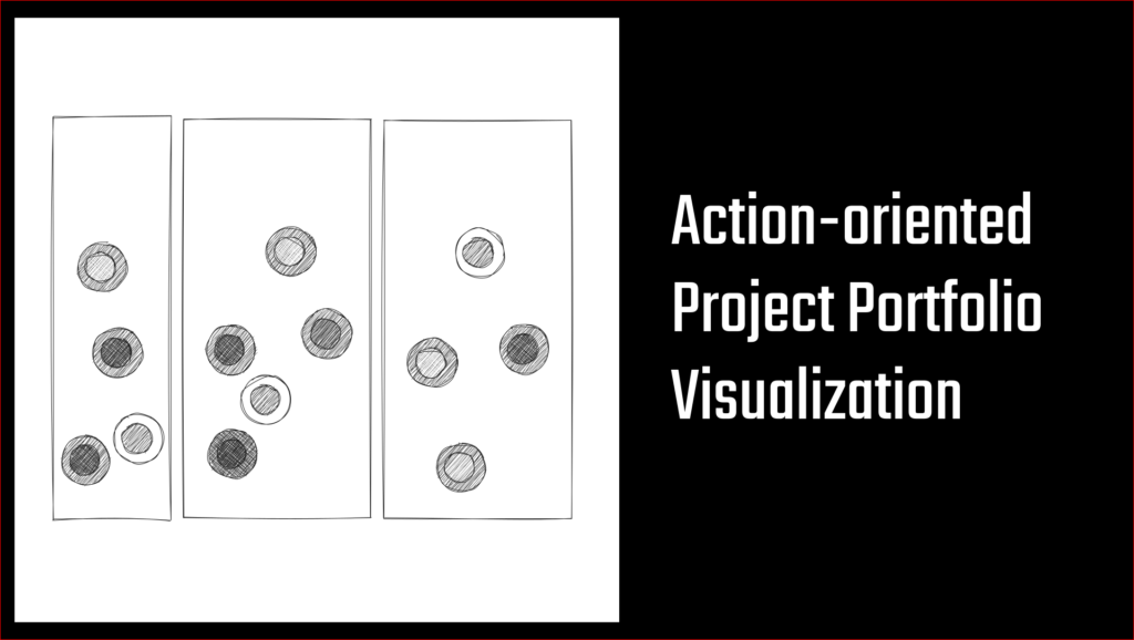
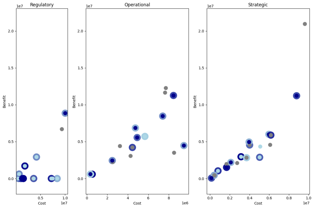
Slicing the elephant
The chart above is not that easy to read and reveals little value for the decision making. A first step is to split the data into three separate categories. These could be different from company to company but quite often you will find something like:
- Regulatory: Projects that are driven by regulatory requirements, legal changes or technical upgrades – so one will have to execute such a project even if there are no benefits attached to it
- Strategic: On the other end of the spectrum there are large, strategic projects that should move the company towards it’s future vision and have sometimes a higher risk profile.
- Operational: Operational projects are the middle ground – the continuous improvements of operational processes.
The segmented plot looks like this:
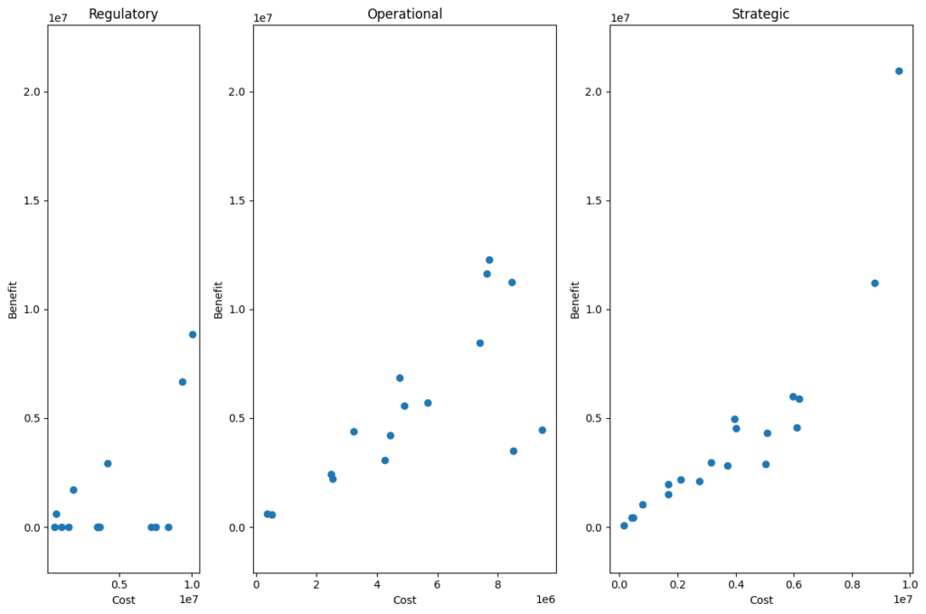
This is already quite helpful in getting an overview and asking some more targeted questions. In this illustrative example the chart above immediately would raise some questions like:
- Why do we have regulatory projects with benefits attached to them? While it is great that for example a technical upgrade also generates some new functionality we might want to separate the regulatory and the functional part. This is especially true for the two projects that seem to be quite expensive at the right end of the regulatory box.
- In general we would expect the bigger and bolder moves in the right hand side box and the more mid-sized efforts in the middle. Based on the plot above we can start to question if some of the small efforts in the strategy bucket could be grouped together and one could also question if some of the large efforts in the middle would be more likely to succeed if broken up into several smaller projects.
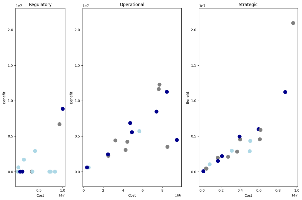
Maturity level
There is one critical element missing in this portfolio view. In German it is usually called “Härtegrad”, i.e. degree of hardness. It describes the maturity level of a project. In real life there are usually 5-7 steps – for this simplified example we focus on the three that are most relevant:

IDEA
The grey circles are in an early idea stage and so far the cost and the benefits are first estimates.

REVIEWED BUSINESS CASE
The light blue projects have a business case that has been reviewed and approved by controlling or a central PMO.

SIGNED OFF BY P&L OWNER
The dark blue circles are the ones that have been signed off by the P&L owner – which importantly is not always the project owner.
Especially the third level is critical for running a successful project portfolio. Quite often the project is being run by a central team in e.g., marketing or operations but the actual savings have to be realized in the countries or business units. For the project to become dark blue it has to be signed by the one who is in charge of the P&L that is going to be impacted by the project after implementation.
Using this kind of color coding results in the chart below:
In an ideal world we could stop here as only the projects that are dark blue should be ready for a decision or starting to spend money. IRL we have to add one more step.
Sunk cost
This last step adds a colored circle behind some of the projects. This circle is White if the project has spend less than 5% of it’s budget. If the project has started to spend money the circle in the background fades from light to dark blue.
This chart summarizes a lot of information for a good discussion.
If we believe in the process we can ignore all the dots with a dark blue center. If the P&L owner has signed the benefits off, they are ideally already included in his business budget and the project is good to go. Having dark blue dots that have not yet started – in particular if they yield more benefits than they cost should trigger a discussion.
Light blue dots should only be started in the regulatory bucket as there sometimes is no benefit that someone could sign off. In the other two areas light blue or even grey projects that started to spend money should be a warning sign and trigger a re-evaluation and potential adjustment.